Adding Draggable pieces
Get the images
Let's add draggable chess pieces in our cells.
First, we need the images of the chess pieces. In src add a new folder named assets. It will contain our app's assets such as images. Create a new folder in assets called pieces. This folder will hold the images of our chess pieces. Download all the assets used in this project from here
Creating the Piece component
Next, create a new folder inside src/components called piece. In components/piece add two files, index.jsx as the component's entry point and piece-styles.css as the css file for this component.
Create a new component named Piece in index.jsx by adding the following code.
Loading images dynamically with require
The Piece component expects to receive two props. A name and pos prop.
The name prop will hold the name of the piece for example K for king(black), recall that white pieces are uppercase and black pieces are lowercase. The pos prop will be the name of the cell holding this piece for example a1.
In the next few lines we try to figure out which piece image to use based on the name and color of this piece. Notice that in the src/assets/pieces folder where we saved the piece images, the images have a consistent name pattern. Each image name comprises of the color (in lowercase) and the type of piece (in uppercase). For example wP.png and bQ.png for white pawn and black queen respectively.
(You can read more about various types of chess pieces here, though it's not required).
We use a ternary expression to derive the color of this piece based on whether it's name is uppercase or not. Next, we concatenate the color and the name of the piece color + name.toUpperCase(). this gives us the name of the image we need to import e.g wB.png for white bishop.
We try to load that image from our assets folder using the computed imageName. We use the require function. require is used to load JavaScript modules but it can also be used to load images, fonts, icons and other assets in React components.
We use require in a try-catch block to catch errors, since empty cells do not contain any name(s) to pass to their Piece components hence no image will be resolved, so in the catch block, we provide an empty fallback image.
Finally in our return statement, we have a img and we set it's src attribute to the value of the image we loaded dynamically. We also set the HTML5 draggable attribute to true. This makes the element draggable.
PropTypes
At the bottom we include PropTypes for this component. PropTypes are used to specify the names and types for the props we expect for this component. We get helpful warnings when we have missing props that are required, or when we provide the wrong types for the props. PropTypes are also a great way of documenting components. We need to import Proptypes from prop-types in order to use them.
Let's add proptypes to our other components, Cell and Board as well. (The use of proptypes is optional).
In the Board component src/components/board/index.jsx, we receive the cells prop which is an array so we add the following lines at the very bottom of the file. Remember to import PropTypes
In Cell component, we receive the cell prop which is an instance of the Cell class in create-board.js so we add the following
Notice that we needed to import the Cell class from the functions/index.js file in order to use it as a type. So let's make sure its exported inside of create-board.js where its defined.
We renamed the import to BoardCell to prevent a name clash with our component.
Finally let's make use of the Piece component inside of our Cell component.
We pass the pos and name props with their values as required
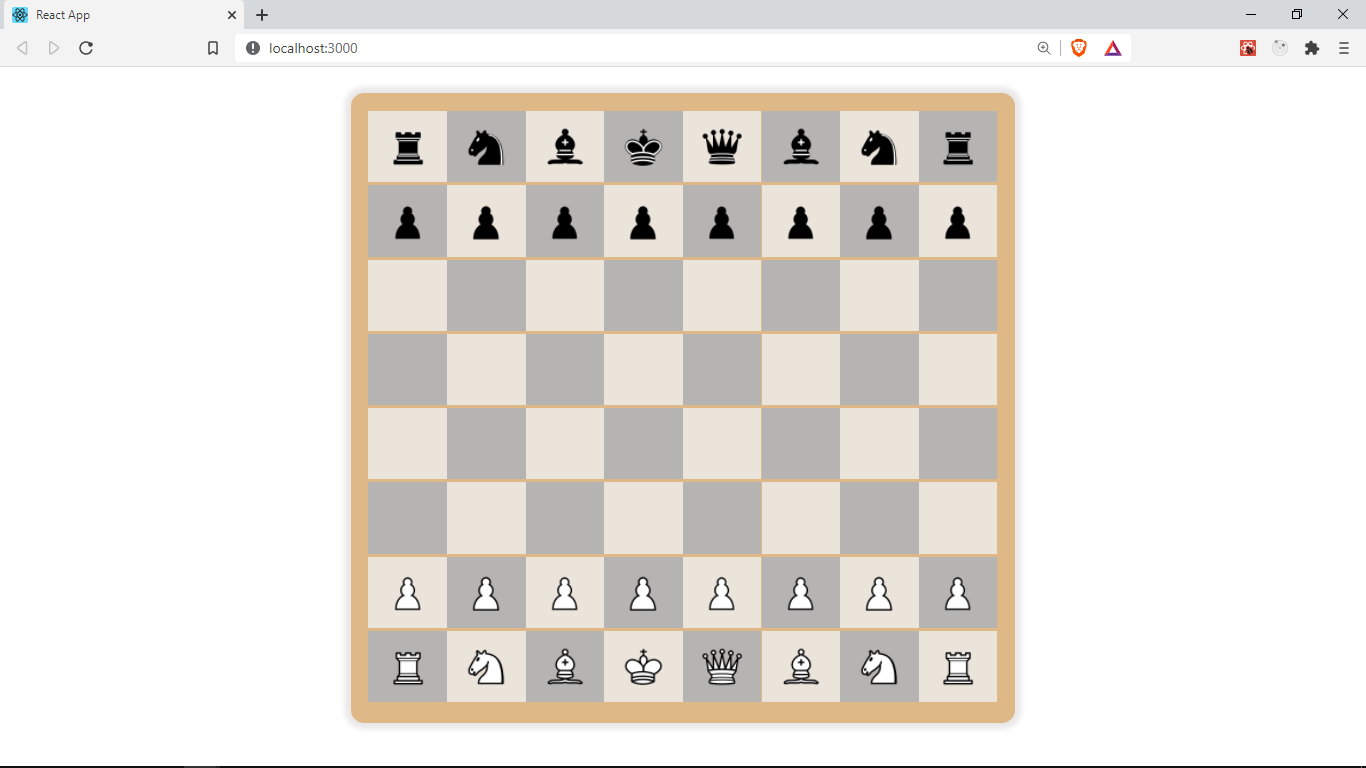
This is what our app looks like at the moment 😃
In the next section, we will be using drag and drop events to drag the pieces across the board to make moves.
Get the full code for this lesson here